
Instructional video has an advantage that glossy promotion often lacks: the viewer arrives with a job to do. That intent can hold attention when the video names the result, shows the real process and removes decisions the viewer should not have to guess. It can also fail spectacularly when the title promises a fix and the first minute delivers biography, branding and setup trivia.
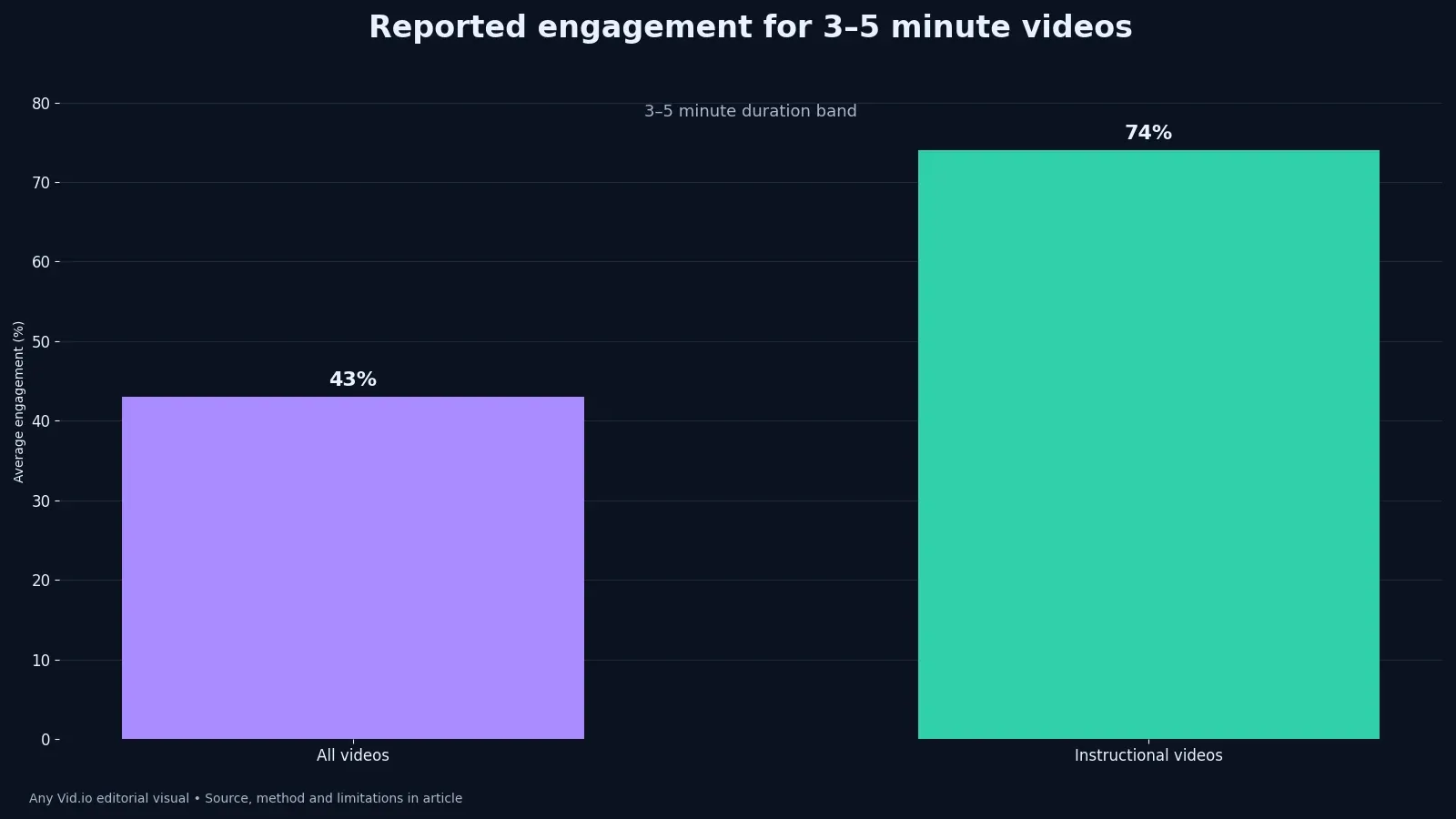
Wistia’s 2024 State of Video analysis reported 43% average engagement across all videos in the three-to-five-minute band and 74% for instructional videos in that band. That 31-point difference is interesting, but it is vendor-hosted aggregate data—not a randomized experiment, a guarantee or a platform-wide benchmark. The useful question is what a creator can test within comparable tutorials.
Understand what the comparison says
Both figures use the same published duration band, which makes the format comparison easier to read than mixed-length averages. A useful review includes one sentence beginning ‘we still do not know.’ That sentence keeps observation separate from explanation. It also creates a clean opening for the next experiment instead of inviting a confident story built from incomplete evidence. Write the alternative explanation beside the preferred one. If both fit the observation, the result is not yet diagnostic. The next version should separate them with a different shot, audience segment, delivery check or deliberately held-constant production choice.
The source does not establish that changing a promotional video’s label to ‘tutorial’ causes a 31-point lift. Quality control should happen on the device and in the context where the audience encounters the work. Studio monitors, editing previews and internal terminology can hide ordinary viewing problems. Watch the delivered result, read the surrounding copy, and verify the action a real viewer can take. Keep raw counts where the interface permits and describe any missing fields. Rates are easier to compare, but counts expose tiny samples and sudden distribution changes. Never reconstruct a denominator from rounded percentages when the platform does not provide it.
Audience intent, topic, traffic source, player context and production choices may differ between groups. Keep the human cost in the same table as the performance signal. Minutes of filming, review burden, moderation, revisions and emotional exposure are part of the result. A tactic that produces a modest lift by doubling fragile labor may be a poor system even when the dashboard looks better. Turn the lesson into a checklist item that appears before the next irreversible step. Advice stored only in a retrospective is easy to admire and easy to ignore. Placement in the workflow is what converts analysis into a repeatable safeguard.
Front-load the usable result
Use the planning approach in the searchable tutorial workflow to state the task and show the outcome early. Build an exit ramp before the test begins. State the safety, rights, workload or audience signal that would stop publication. Clear stopping rules help a team move quickly because they replace last-minute bargaining with decisions already connected to the brief. If collaborators are involved, agree on the metric definition and approval standard before work begins. Editors, clients and creators often use the same word for different outcomes. One written example prevents a later argument about what ‘engagement,’ ‘usable’ or ‘approved’ meant.
Name materials, prerequisite knowledge and a meaningful limitation before the viewer commits to the process. The final artifact should be reusable. Save the approved language, measurement definition, visual reference and result beside the project—not only the finished file. Future work improves when the reasoning survives after the timeline and chat messages disappear. Review the work at normal speed before frame-by-frame inspection. Severe artifacts deserve technical attention, but a microscopic flaw that no viewer can perceive should not automatically outrank story clarity, accessibility, consent or the promised practical result.
Cut credentials and origin stories unless they directly change the viewer’s next action. Do not reward a surprising result with a new myth. Check the raw observation, inspect outliers, and ask whether the metric answered the original question. The strongest conclusion may be narrower than the headline, but it will be more useful when the next project differs from this one. Preserve the version that served as the baseline. Without it, improvement becomes a story told by the newest file. A side-by-side comparison also helps the team avoid fixing one visible weakness by quietly introducing a different problem elsewhere.
Structure demonstration, not summary
Show the action at the scale and angle needed to copy it, then explain why the action matters. Finally, communicate the limitation where the claim appears. A footnote at the bottom cannot fully repair an exaggerated headline, and a disclaimer cannot rescue an inaccurate promise. Precise language is part of the strategy because it attracts the audience the content can genuinely serve. When the outcome is mixed, resist averaging incompatible signals into a single score. State what improved, what worsened and what stayed unknown. A qualified decision is more actionable than a composite number whose weighting nobody can defend.
Use a wide view for orientation, a close view for the critical move and a result view for verification. That sounds simple, but it changes the working question. Instead of asking whether the post was ‘good,’ the review asks which promise was made, what evidence the viewer received, and where the result departed from the plan. A useful note names the next decision; a vague verdict merely preserves the team’s mood. Consider the people excluded by the measurement. Silent viewers, people using captions, subscribers arriving later and clients judging deliverables may matter even when the dashboard centers immediate public reactions. Add a qualitative check for the audience the metric cannot describe.
When filming alone, borrow coverage logic from the six-shot B-roll system without turning every step into decorative footage. Put this in the project brief before production. The brief should identify the intended viewer, the observable behavior, the review window and the person empowered to stop the test. Pre-committing prevents a large reach number from erasing cost, confusion, weak fit or an uncomfortable audience response after the fact. Finally, date the recommendation. Platform controls, pricing, support and technical requirements change, while the article’s underlying decision method should remain useful. A visible access date makes later verification routine instead of treating old operational details as permanent facts.
Make the video accessible
Use the W3C audio and video accessibility guidance to plan captions, transcripts and descriptions appropriate to the content. A solo creator can make the method smaller without making it sloppy. Use one content family, one delivery surface and a short observation window. Change a coherent variable, capture the result, and write down what else moved. The discipline matters more than the size of the dashboard. For the working review, capture one screenshot or export from the relevant stage, write the exact setting or audience condition, and compare it with the planned result. Evidence that can be revisited is more reliable than a confident recollection after publication.
Put essential values and warnings in narration and captions, not only in a tiny on-screen label. Success has to be visible outside analytics. The piece should answer the promised question more clearly, take less fragile labor, create a better conversation or lead to an appropriate business action. If the metric rises while trust or accuracy falls, the experiment has exposed a trade-off rather than a win. Ask a second person to follow the instruction without verbal coaching. Note the point where they hesitate, the assumption they make, and the proof that resolves it. Those observations often reveal a better edit than another round of generalized polishing.
Pause long enough on physical actions for a viewer to perceive the change without lowering playback speed. Record the rejected version too. Failed openings, unusable generations and broken exports reveal constraints that a polished final cut hides. A compact log—date, source, change, owner, result and uncertainty—is enough to prevent the same attractive mistake from returning in the next production cycle. Set the review date while the decision is still emotionally neutral. Early checking rewards noise; indefinite checking encourages selective memory. A fixed window gives comparable work the same opportunity and makes exceptions visible when outside events genuinely require them.
Run a fair within-channel test
Choose several tutorials with similar intent and duration rather than comparing one tutorial with an entertainment outlier. Before copying the tactic, ask what else happened at the same time. Topic demand, audience composition, creative quality, distribution, seasonality and collaboration can all move together. An honest review often concludes that a bundle worked under specific conditions while the contribution of each component remains uncertain. Write the alternative explanation beside the preferred one. If both fit the observation, the result is not yet diagnostic. The next version should separate them with a different shot, audience segment, delivery check or deliberately held-constant production choice.
Track starts, average engagement, completion, saves, useful questions and production time using consistent windows. Make the next test cheaper than the claim that inspired it. Reuse lawful source material, limit the number of variants, and define what would make you continue, revise or stop. A small test protects time and reputation while still producing information that can improve the next brief. Keep raw counts where the interface permits and describe any missing fields. Rates are easier to compare, but counts expose tiny samples and sudden distribution changes. Never reconstruct a denominator from rounded percentages when the platform does not provide it.
Apply the measurement cautions from the five-million-video engagement study before treating one aggregate metric as quality. Editorial judgment remains the final control. Data can reveal a pattern and documentation can reduce ambiguity, but neither decides what suits the creator’s voice, capacity or duty to the audience. Someone should be able to explain the decision in plain language without invoking a mysterious algorithm. Turn the lesson into a checklist item that appears before the next irreversible step. Advice stored only in a retrospective is easy to admire and easy to ignore. Placement in the workflow is what converts analysis into a repeatable safeguard.
Diagnose the drop-off
An immediate fall often signals expectation mismatch; a drop at the first complex action may indicate missing setup or poor camera placement. Compare like with like. A tutorial, reaction, product demonstration and narrative scene ask different things of a viewer, so one universal target is rarely useful. Build a local comparison group with similar intent and duration, then keep the exceptions visible rather than averaging them away. If collaborators are involved, agree on the metric definition and approval standard before work begins. Editors, clients and creators often use the same word for different outcomes. One written example prevents a later argument about what ‘engagement,’ ‘usable’ or ‘approved’ meant.
A stable middle with a late decline may simply mean the viewer received the promised result before a padded ending. The audience should not have to reverse-engineer the premise. Use concrete nouns, observable actions and an early indication of the payoff. That does not require frantic editing; it requires alignment between packaging and what the video actually delivers. Review the work at normal speed before frame-by-frame inspection. Severe artifacts deserve technical attention, but a microscopic flaw that no viewer can perceive should not automatically outrank story clarity, accessibility, consent or the promised practical result.
Revise the moment that created confusion, then test again; do not speed up every cut because one graph moved. Operationally, assign this decision a home. It might live in the storyboard, rights log, offer sheet, export checklist or analytics review, but it should not depend on memory. The best systems make the responsible action easier at the moment pressure is highest. Preserve the version that served as the baseline. Without it, improvement becomes a story told by the newest file. A side-by-side comparison also helps the team avoid fixing one visible weakness by quietly introducing a different problem elsewhere.
Working table
| Viewer need | Production choice | Evidence of success |
|---|---|---|
| Know the outcome | Show the finished result and state the task early | Qualified viewers continue into setup |
| Copy the action | Use an angle that reveals hand position and sequence | Fewer clarification comments about the basic move |
| Recover from errors | Include the likely failure and correction | Viewers can diagnose their own attempt |
| Verify completion | Show a clear success state | Saves, completions or useful follow-up questions |
Use this table as the decision record for Why Instructional Videos Held 74% Engagement: Reading the Data rather than as decoration. Replace illustrative values with dated first-party observations, keep definitions beside each result, and preserve the source whenever a published figure informs the plan. The strongest row is the one that changes what the team will do next.
Put the method to work
Film one tutorial around a task you can demonstrate cleanly, then watch a new viewer attempt it without coaching. The hesitation you observe is the next edit. Keep the comparison inside a genuinely similar set and allow the result to contradict the attractive 74% headline.
The AnyVid.io blog includes more production and analytics guides. When retaining demonstration footage or references, save only media you created, own, or have permission or another lawful right to save.
Frequently asked questions
Does 74% mean every tutorial should target that number?
No. It is an aggregate reported by Wistia for instructional videos in a specific duration band. Your audience, topic, traffic sources and player context may differ. Build a comparable internal baseline rather than treating it as a pass/fail threshold.
Is engagement the same as completion rate?
Not necessarily. Metric definitions vary by platform and report. Wistia describes average engagement in its own context. Confirm the definition in the source and your dashboard before comparing values, and keep total watch time and viewer intent in view.
Should a tutorial always be under five minutes?
No. The reported comparison concerns a three-to-five-minute band; it does not prove that longer instruction is worse. Use the time needed to deliver the task clearly, then remove material that does not support the viewer’s result.
Why show mistakes in a tutorial?
A likely failure point often teaches more than a flawless pass. Showing the symptom, cause and correction helps viewers recover independently. Keep the example safe and representative rather than manufacturing drama.
Do captions improve instructional video?
Captions support viewers who are deaf or hard of hearing and can help in sound-sensitive environments, but accuracy and synchronization matter. Important visual information may also need spoken or written description depending on the content.
Was this article helpful?
Tell us what worked so we can improve future content.