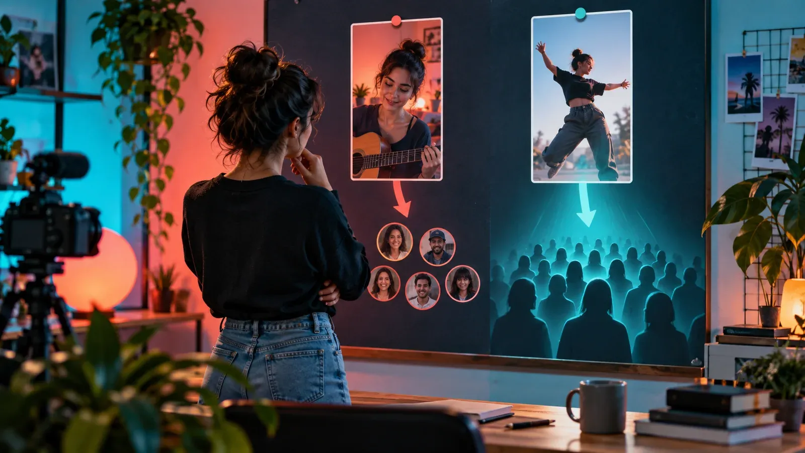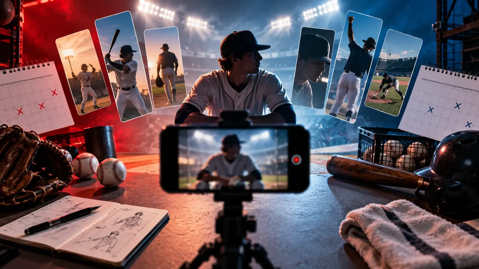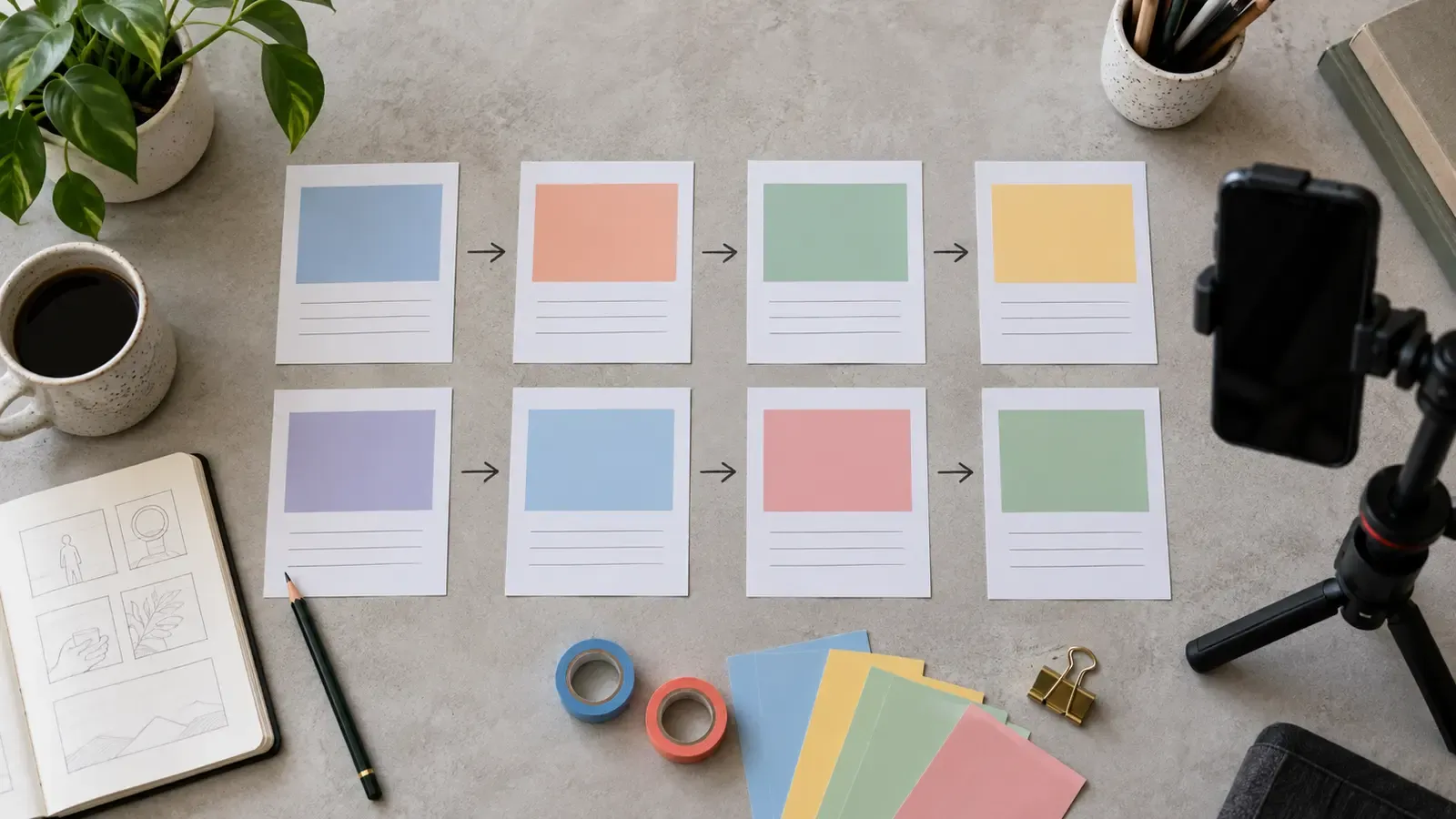
A Reel cover is asked to do several jobs in several shapes. It may appear tall, compact or cropped inside a profile grid, and the viewer may see it at the size of a postage stamp. A design that feels spacious on an editing canvas can lose the face, object or key action as soon as the surrounding edges disappear.
This guide treats the cover as a small responsive layout. You will choose one focal promise, build a crop-safe center, test hierarchy at thumbnail size and export a version that remains useful even when the interface changes. Instagram’s exact presentation can vary by surface and update, so use the current preview in your own account as the final check.
Give the cover one job
Decide whether the cover identifies a result, subject, mistake, comparison or episode. That sounds simple until a real deadline compresses the choices. The practical move is to decide what the viewer must notice, what the creator must preserve, and what can safely vary. Write those three things beside the project before changing tools or adding polish. A visible decision is easier to review than an instinct remembered after publishing.
Remove props and background detail that do not help that single recognition task. Test the idea on the roughest useful version, not on a finished piece that is expensive to change. Watch it once as a viewer and once as an editor. During the viewer pass, note confusion without stopping. During the editor pass, trace each confusing moment back to a shot, sentence, transition or missing piece of evidence.
Match the cover promise to the Reel instead of using a dramatic image the video never earns. There is a trade-off here. Consistency reduces effort and helps recognition, but too much consistency can hide weak thinking. Keep the part that carries meaning stable; vary the part that merely expresses it. This gives the workflow a backbone without turning every post into a duplicate of the last one.
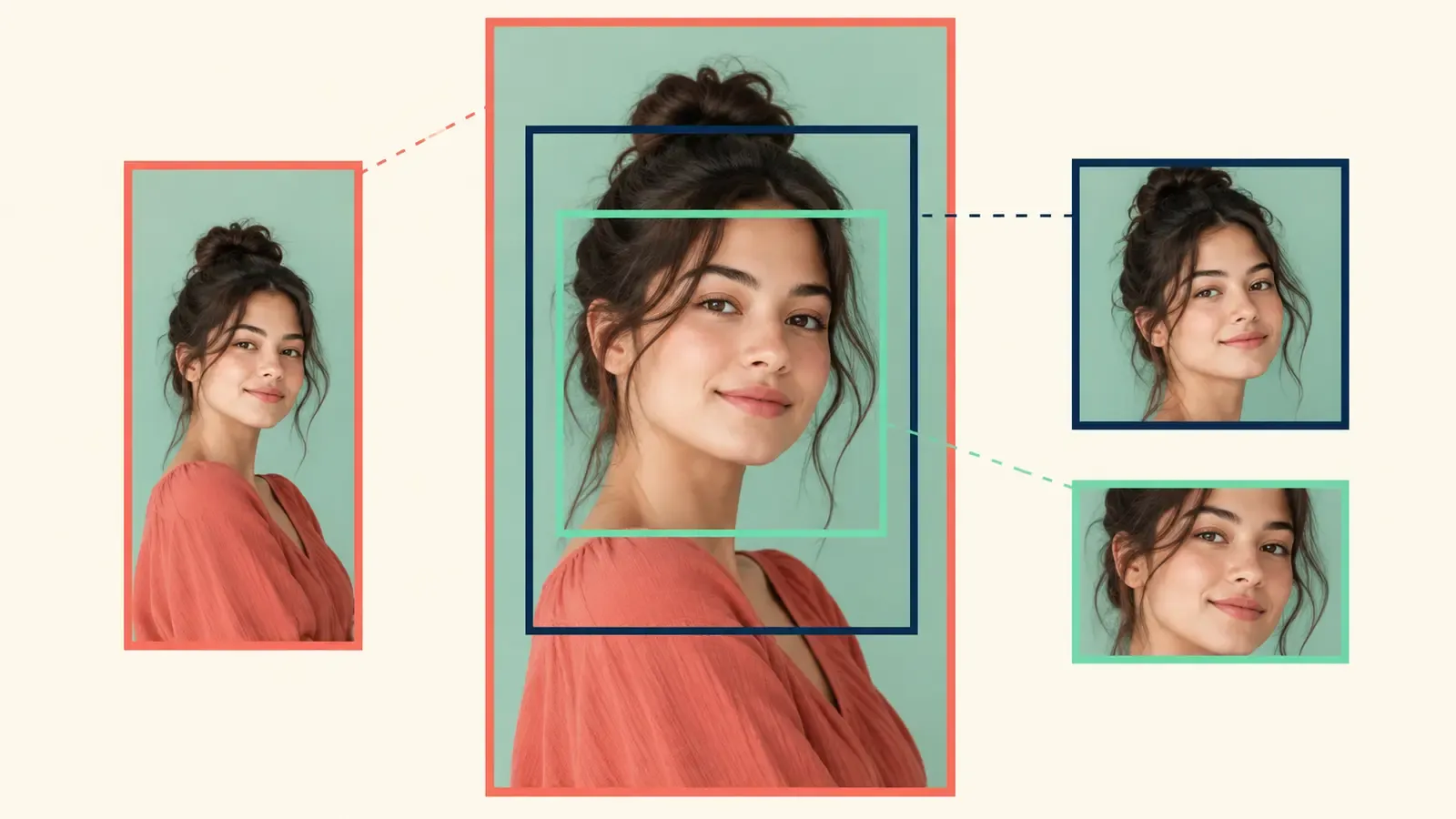
Build a crop-safe focal zone
Place the essential face, object or gesture near the center with breathing room around it. A common failure is to optimize the visible symptom while leaving the cause untouched. Before acting, name the audience, the job they are trying to complete and the proof they receive. If those three elements do not agree, a more attractive edit may improve appearance while making the communication less honest.
Treat the outer edges as expendable atmosphere rather than a home for crucial information. Treat the result as evidence rather than a personal grade. Record what changed, the conditions around the change and what you expected to happen. That note lets you compare similar projects later without inventing a story around one unusually strong or weak result.
Preview multiple crops with guides, then hide the guides and judge the composition as a viewer. The checkpoint should be quick enough to survive ordinary production. If it requires a perfect studio, a large team or an hour of analysis for every post, it will disappear when work gets busy. Reduce it to a repeatable question, a visible artifact and a clear pass condition.
Make hierarchy work at small size
Choose one dominant subject and one supporting cue rather than five equal elements. Ask a second person to explain what they think the piece promises before you tell them your intention. Their wording is useful even when you disagree. It reveals what the material communicates without the creator's private context, which is exactly the gap that viewers face.
Use contrast in brightness, color and scale to separate the subject from the background. That sounds simple until a real deadline compresses the choices. The practical move is to decide what the viewer must notice, what the creator must preserve, and what can safely vary. Write those three things beside the project before changing tools or adding polish. A visible decision is easier to review than an instinct remembered after publishing.
Shrink the image on screen until decorative detail disappears and confirm the idea still reads. Test the idea on the roughest useful version, not on a finished piece that is expensive to change. Watch it once as a viewer and once as an editor. During the viewer pass, note confusion without stopping. During the editor pass, trace each confusing moment back to a shot, sentence, transition or missing piece of evidence.
Use text only when it earns space
Keep wording short, literal and large enough to read without zooming. There is a trade-off here. Consistency reduces effort and helps recognition, but too much consistency can hide weak thinking. Keep the part that carries meaning stable; vary the part that merely expresses it. This gives the workflow a backbone without turning every post into a duplicate of the last one.
Avoid placing text over busy textures or too close to crop boundaries. A common failure is to optimize the visible symptom while leaving the cause untouched. Before acting, name the audience, the job they are trying to complete and the proof they receive. If those three elements do not agree, a more attractive edit may improve appearance while making the communication less honest.
Test a text-free version because a strong visual result may communicate faster. Treat the result as evidence rather than a personal grade. Record what changed, the conditions around the change and what you expected to happen. That note lets you compare similar projects later without inventing a story around one unusually strong or weak result.
Build flexible templates
Lock type scale, safe margins and a few brand colors while allowing imagery to change. The checkpoint should be quick enough to survive ordinary production. If it requires a perfect studio, a large team or an hour of analysis for every post, it will disappear when work gets busy. Reduce it to a repeatable question, a visible artifact and a clear pass condition.
Create variants for face-led, object-led and comparison-led episodes. Ask a second person to explain what they think the piece promises before you tell them your intention. Their wording is useful even when you disagree. It reveals what the material communicates without the creator's private context, which is exactly the gap that viewers face.
Avoid forcing every subject into the same pose simply to preserve a rigid template. That sounds simple until a real deadline compresses the choices. The practical move is to decide what the viewer must notice, what the creator must preserve, and what can safely vary. Write those three things beside the project before changing tools or adding polish. A visible decision is easier to review than an instinct remembered after publishing.
Run three preview tests
Check the full cover, a centered compact crop and a very small card preview. Test the idea on the roughest useful version, not on a finished piece that is expensive to change. Watch it once as a viewer and once as an editor. During the viewer pass, note confusion without stopping. During the editor pass, trace each confusing moment back to a shot, sentence, transition or missing piece of evidence.
Inspect the cover on a dim screen and against both light and dark surrounding interfaces. There is a trade-off here. Consistency reduces effort and helps recognition, but too much consistency can hide weak thinking. Keep the part that carries meaning stable; vary the part that merely expresses it. This gives the workflow a backbone without turning every post into a duplicate of the last one.
Ask a reviewer to name the subject and expected value without seeing the caption. A common failure is to optimize the visible symptom while leaving the cause untouched. Before acting, name the audience, the job they are trying to complete and the proof they receive. If those three elements do not agree, a more attractive edit may improve appearance while making the communication less honest.
| Check | What to inspect |
|---|---|
| 1 | Check the full cover, a centered compact crop and a very small card preview. |
| 2 | Inspect the cover on a dim screen and against both light and dark surrounding interfaces. |
| 3 | Ask a reviewer to name the subject and expected value without seeing the caption. |
Export and archive cleanly
Use the current dimensions and file requirements shown by Instagram at upload time. Treat the result as evidence rather than a personal grade. Record what changed, the conditions around the change and what you expected to happen. That note lets you compare similar projects later without inventing a story around one unusually strong or weak result.
Keep an editable master with guides separate from the flattened delivery file. The checkpoint should be quick enough to survive ordinary production. If it requires a perfect studio, a large team or an hour of analysis for every post, it will disappear when work gets busy. Reduce it to a repeatable question, a visible artifact and a clear pass condition.
Name versions by episode and crop test so future updates do not become guesswork. Ask a second person to explain what they think the piece promises before you tell them your intention. Their wording is useful even when you disagree. It reveals what the material communicates without the creator's private context, which is exactly the gap that viewers face.
Diagnose weak covers
If a face is cut off, reduce scale or reposition the source rather than shrinking every element. That sounds simple until a real deadline compresses the choices. The practical move is to decide what the viewer must notice, what the creator must preserve, and what can safely vary. Write those three things beside the project before changing tools or adding polish. A visible decision is easier to review than an instinct remembered after publishing.
If the idea is unclear, strengthen the focal object before adding more words. Test the idea on the roughest useful version, not on a finished piece that is expensive to change. Watch it once as a viewer and once as an editor. During the viewer pass, note confusion without stopping. During the editor pass, trace each confusing moment back to a shot, sentence, transition or missing piece of evidence.
If the grid feels repetitive, vary shot type and color balance while retaining the safe structure. There is a trade-off here. Consistency reduces effort and helps recognition, but too much consistency can hide weak thinking. Keep the part that carries meaning stable; vary the part that merely expresses it. This gives the workflow a backbone without turning every post into a duplicate of the last one.
Illustrative case study: the cover that worked only full-screen
A food creator designs a beautiful tall cover around a finished cake, with utensils and ingredients framing the edges. In the editor it feels generous and premium. In the profile grid, the cake remains visible but the sliced interior—the actual promise of the Reel—falls outside the crop. Every object is attractive, yet the cover no longer explains why this episode matters.
She rebuilds the cover around the slice, moves it into the central safe zone and lets the outer utensils become optional atmosphere. A tiny two-word label sits above the slice with enough contrast to survive reduction. She does not claim that the new cover will increase reach; she simply verifies that viewers can identify the episode in every preview she controls.
The useful lesson is not “always zoom in.” It is to protect the evidence of the promise. A landscape tutorial may need a hand gesture; a makeover may need the after-state; an interview may need the guest. The focal evidence changes, while the crop-safe logic stays stable.
Keep a working record
A lightweight record makes this process teachable. Save the brief, first draft, decisive changes, permissions or source notes, final export and one paragraph about the outcome. For creators whose Reel covers look good full-screen but fail in grids and compact cards, that record is more valuable than a folder full of unnamed versions because it shows why a choice was made.
Keep rejected options too, especially when they looked attractive but weakened the audience promise, exceeded the budget or created a rights problem. A short reason is enough. Over several projects, these notes reveal recurring friction and help separate a workflow problem from a one-off production accident.
Review the record after the agreed observation window. Mark what you know, what remains uncertain and what deserves another test. Do not rewrite the original hypothesis to make the outcome seem predictable. Honest notes protect the usefulness of both successful and disappointing work.
Choose the next useful step
Apply the framework to one active project before expanding it into a larger system. The first pass should expose a concrete decision, not create more administration. Read Plan an Instagram Reels Series With a Promise–Proof–Payoff Board. Read Shoot B-Roll Alone With a Six-Shot Coverage System. Browse the AnyVid.io blog for related creator education. When reference media is involved, use only media you created, own, or have permission or another lawful right to save.
Frequently asked questions
What should stay inside the crop-safe area?
Keep the irreplaceable information there: the face, result, product detail, gesture or small amount of essential text. Background texture and supporting props can extend outward because losing them should not change the cover’s meaning.
Should every Reel cover include text?
No. Text is useful when it clarifies a subtle difference between episodes, but it can also become unreadable clutter. Test the visual without words first. If text is necessary, keep it brief, high-contrast and away from likely crop boundaries.
Can I use the first video frame as the cover?
You can, but judge it as a still image. Motion blur, a half-finished gesture or subtitle fragments may make a poor thumbnail. A deliberately selected frame or separately composed cover often communicates the subject more clearly.
How do I test covers before publishing?
Place the design into several crop guides, reduce it to small-card size and preview it on a phone. Use Instagram’s current upload preview as the final authority because surfaces and controls can change.
Should I redesign old covers?
Prioritize old posts that still receive profile traffic and whose covers genuinely misrepresent or hide the content. Note that Instagram may limit cover changes after publishing. Where editing is unavailable, improve the system for future posts instead of rebuilding files you cannot apply.
Was this article helpful?
Tell us what worked so we can improve future content.